Google’s new look for mobile search results puts site owners and publishers first – TechCrunch - 2 minutes read
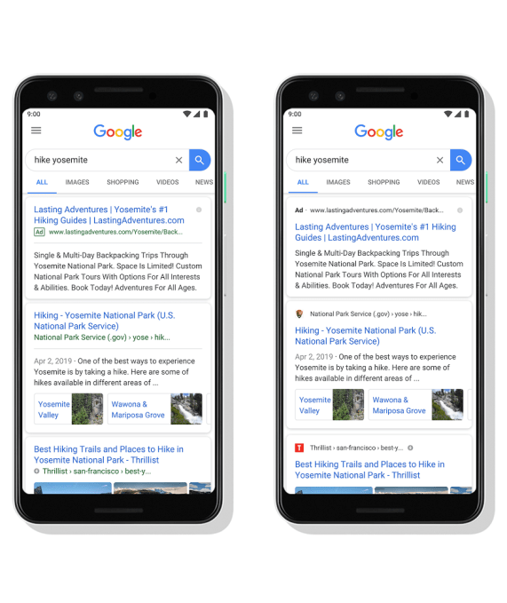
Google today unveiled a new look for its mobile search results which gives sites a way to showcase their own branding, instead of looking like every other blue link. Before, the search results were blue and the source — a publisher’s site, for example — would appear below in a smaller, green font. Now, it’s the publisher who gets top billing. With the refresh, the source for the search result appears on top and includes the site’s own icon.
The revamp is subtle, but one that will likely please publishers as it gives them a way to stand out. After all, web searchers who are already familiar with the publisher’s site may choose to click through (or rather, tap through) to their link out of a personal preference — even if it’s further down on the results page.
In addition, the website branding can help web searchers better understand where the information is coming from — like an official site or well-known news publication, for example.

The update also impacts how Google Search ads appear.
Before, the word “Ad” would display in a small green box ahead of the source link. Now, the word “Ad” appears in a bolded, black font where the website icon would otherwise be. It’s a bit less noticeable that the top search results link is an ad because your eyes are drawn to the blue link — and because the word “Ad” no longer has a box around it.
Google says the new design will help it prepare for the search changes ahead as it enables the company to add more action buttons and previews to the search result cards, while still retaining attribution back to the source.
The company recently announced some of its plans for new search features at Google I/O earlier this month, including AR in search results, as well as better news coverage and support for podcast search. The latter will offer links to listen right in the search results as well as tools to save the podcast to play later.
In the meantime, site owners and publishers who want to customize their icon for their organic search listings can do so here.
Google says this new design is rolling out first to mobile users over the next few days.