New York Jets reintroduces jet to team logo in nostalgic rebrand - 4 minutes read

The New York Jets NFL team has brought back a jet aircraft to its logo as part of its latest rebrand, which is a nod to its 1980s Sack Exchange era.
Designed to combine "coolness and nostalgia, the rebrand reintroduces a jet – the American football team's namesake – to the logo for the first time since 1997.
The design is a modernised update of a logo originally designed by Jim Pons, the team's former video director and former bass guitarist for Frank Zappa's band, The Mothers of Invention. The original logo was used during the 1970s, '80s and '90s and is connected to the team's fondly-remembered New York Sack Exchange era.
The New York Jets has unveiled an updated logo
"We've modernised it, I think it's an improvement," said New York Jets vice president of fan commerce Chris Pierce.
"It is a piece of iconic architecture in our history and certainly a moment in time for New York," he told Dezeen.
"It feels like we are taking an asset from this great movie on this amazing stage – there was buzz about the '70s and '80s in New York City – and bringing it back to life."
It is a return to the team's 1970s, 80s and 90s logo
While the logo is a clear nod to the club's history, the design team aimed to ensure that the team's rebrand also looks to the future.
"There's an element of coolness and an element of nostalgia," said Pierce. "As much as this feels like a look backward and honouring the history and legacy, there's something so optimistic and forward thinking and part of that is the design of the logo."
"It's italicised, the plane is moving. So you get this notion of a forward-thinking logo as much as it's something from our history," he continued.
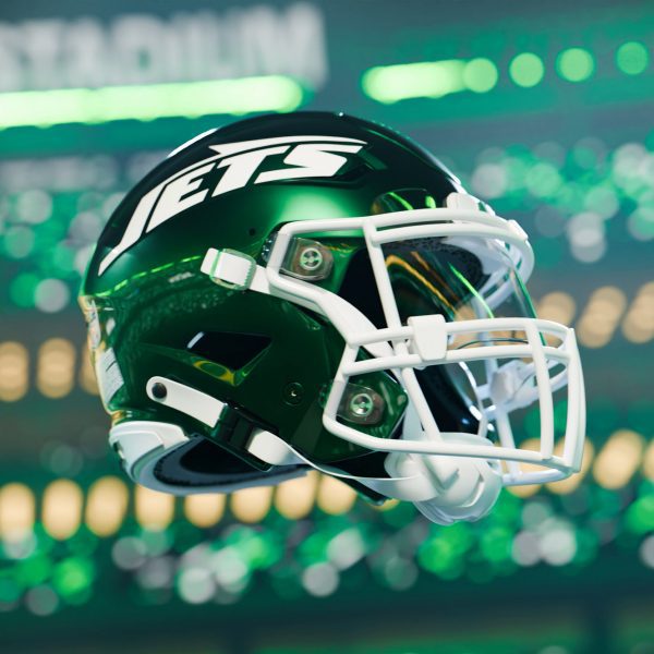
The logo will be used across the brand and on the team's helmets
The team neatened up the original design, which was hand-drawn by Pons in the late 1970s and used as the team's primary logo from 1978 until 1997, to make it "stronger and slightly bolder".
The spacing between the letters has been adjusted to be more consistent, while the tail of the J is taller and thicker and the jet itself is more pointed.
Read: Super Bowl stadium designed to be "fast, angry and intimidating"
"We put that logo under the microscope and asked is this perfect for applications that exist in 2024 that did not exist in 1978," explained Pierce.
"We then made some modernisations and tweaks to the logo – things like the spacing between the letters, because it was a hand-drawn logo, there was some lack of consistency," he continued.
"The tail of the aircraft and the nose, they're more pointed. And we feel like give this element of more speed, versus the more rounded tail, the more rounded nose of the plane."
The team has also updated its uniforms
According to Pierce, returning to the previous logo was driven by the team's fans, particularly their reaction to the Jets using the logo last season.
"It became evident that there was a desire amongst our fans to bring back a logo that they really identified with," he said. "And they had this deep emotional connection with, right, that they just they call for it right in terms of their response to it."
"So for us, it was very obvious that this screams our identity, why should we not bring it back?" he added.
The uniform is a nod to the New York Sack Exchange era
Adding the jet back to the logo also helps to explain the name of the team, which was changed from the Titans of New York in 1963 to the Jets due to its stadium's proximity to LaGuardia Airport.
"I do think bringing the jet back and making that connection is a really important one," explained Pierce.
"I think, in many ways, it's even more important to the more casual fan, or the fan that doesn't know they're a Jets fan yet and hasn't picked an NFL allegiance yet. I think that's really somewhat critical."
The team has launched three uniforms
The redesigned logo forms part of a wider rebrand of the team including the launch of the Legacy Collection of uniforms, which players will wear for the next five seasons.
The three uniforms – green, white and black – will all have double-striped sleeves and single-striped legs, which match the uniforms worn in the Sack Exchange era.
While the New York Jets are updating its brand, several other NFL teams have recently announced plans to refresh their stadiums. Architecture studio Populous is designing an "intimate yet intimidating" stadium for Buffalo Bills while HOK is designing a mirrored "stadium of the future" for the Jacksonville Jaguars.
Source: Dezeen
Powered by NewsAPI.org