Motion website blocker aims to improve your focus online as you WFH - 3 minutes read
 Y Combinator’s latest class of startups arrived to a fairly lukewarm public reception last week as the world melted down in the midst of the accelerator’s virtual demo day. While the startups didn’t anticipate launching into mid-pandemic markets, some seem more poised to succeed in this new environment than others.
For the past several weeks, I’ve been playing around with one of those startups’ tools. Motion, a free Chrome productivity plugin, tries to lead you away from visiting sites that you feel aren’t great for your productivity. It was a nice-to-have tool for the weeks preceding SF’s shelter in place mandate, but since I’ve started working from home full-time, all-the-time, forever, the tool has become a welcome way to separate my for-work online browsing and the for-boredom online browsing after 6pm.
A plugin that blocks websites you don’t want to visit is hardly revolutionary. There are plenty of these plugins already, but as is the case with all software, sometimes a few UX advances make all the difference. With Motion, the differentiation is the underlying psychology of the product, which eschews the central focus on black lists and white lists, instead promoting the idea of helpful pushes more in spirit with OS-level screen-time apps.
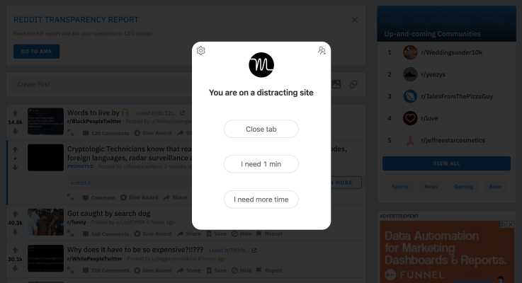
After installing Motion, you can set your productive hours and designate the sites you deem as beneficial and harmful to your productivity. For instance, I wanted to cut out Reddit, Facebook and YouTube from my work-hours browsing. Now, going forward, any time that you type in the URL of an offending website, the plugin will throw you a full-page alert that you can dismiss or temporarily hush.
Telling it that you need a minute will actually toss a countdown timer onto the screen, pushing you to get what you “need” out of Facebook or Reddit. Once that timer runs out, you can extend your abbreviated binge or take the preferred route — clicking a button that closes out the tab. The UX of the app makes room for exceptions, but still pushes users to reduce time on those sites, a big differentiator from more absolutist options.
One of Motion’s best features offers a diagnosable snapshot of your web browsing habits when you first open your browser each day. The screen shares the time you spent on each site during the previous day, allowing you to track how the tool has reduced your browsing time on certain sites and identify other URLs that you may also want to block.
Motion as a product is still in its early stages of evolution, and I’ve seen a number of improvements over my few weeks of usage, what I’ll be most curious to see is how the founding team shapes the product into a viable business moving forward. The free Chrome plug-in as a service model hasn’t proven itself yet, but the founding team has ambitions for creating paid tiers and enterprise products down the road, once the core product has been built out a bit more.
Source: TechCrunch
Powered by NewsAPI.org