iPadOS 14 focuses on giving apps a macOS feel - 2 minutes read
 Apple showcased a few new tablet-specific updates coming to iPadOS that aim to appease users hungry for software that treats the devices as laptop replacements.
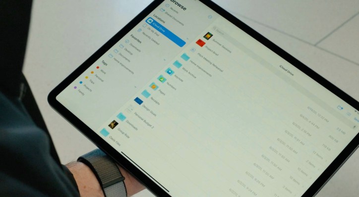
Apple’s iPad-specific updates are fairly low-key this year. The big change is how Apple’s stock apps are being designed with an eye toward sidebars and drop-down menus. It all sounds pretty dry, but it brings a decidedly more complex and macOS-esque design to the iPad making better use of the screen real estate. Apple specifically highlighted design updates to the Photos, Files and Calendar apps.
The design changes address one of the common complaints around computing on the iPad; that users aren’t able to harness the full power of the device because apps are still being held to iPhone design paradigms. With the company’s new support for multitouch external input like the new Magic Keyboard’s trackpad, Apple’s design needs are moving toward more productivity-minded interfaces that fit more on a single screen. We’ll see how developers choose to change up their iPad designs with these new templates.
Speaking of fitting more onscreen, the iPad will also be supporting the widening availability of widgets on the home screen. Now that the action is available center stage on iPhone, expect more devs to add support for this.
Apple spent the most time of the iPadOS presentation talking about Scribble, a new feature for Apple Pencil that allows users to do more with onscreen handwriting, enabling users to scribble into onscreen text boxes and quickly convert the handwriting to plain text. This means you can write something directly into the Safari search bar and quickly search without tapping on the keyboard. The feature means users have more flexibility to stick with their chosen mode of input.
iPadOS arrives in the fall.
Source: TechCrunch
Powered by NewsAPI.org