Mozilla gives Firefox a new logo as it looks beyond the browser – TechCrunch - 2 minutes read
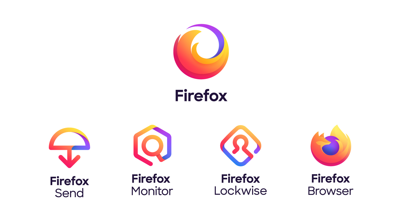
Mozilla’s Firefox is getting a new logo that is meant to reflect that the brand now stands for more than a browser.
With products like its password manager Lockwise, private file sharing service Send and security tools like Firefox Monitor, Mozilla has greatly expanded the brand. That’s a challenge no branding expert can refuse, so it’s no surprise the organization went on a quest for new logos and an update to its iconic Firefox brand.
In its announcement, Mozilla talks a lot about how the brand system rests on ideas like ‘it’s a radical act to be optimistic about the future of the internet’ and ‘we make transparency and a global perspective integral to our brand, speaking many languages and striving to reflect all vantage points.’
The result of this exercise is an updated Firefox logo that takes the fox out of the equation and basically only leaves the tail. To confuse things, though, that’s the brand for the overall Firefox brand — the browser itself still features a stylized fox wrapped around a ball.
That’s been the overall evolution of the brand in recent years anyway, so it’s not all that radical a change. Other Mozilla products use the same color palette, yet with a different system of shapes and a new typeface.

“As a living brand, Firefox will never be done,” Mozilla writes today. “It will continue to evolve as we change and the world changes around us.”
What’s probably more important, though, is that the Firefox browser tech continues to evolve in step with its competitors. After a long slog, Firefox is finally a competitive browser again. The last time this happened, Mozilla lost focus by trying to build a mobile operating system and lots of other side-projects. This time around, it seems to have a clearer mission that centers around privacy, so hopefully, it’ll be able to avoid the pitfalls of branching out well beyond the browser.