Slack Drops a Big Redesign to Change How You Chat - 3 minutes read

Your work chats are going to look very different very soon. On Wednesday, Slack said it would update its interface for the first time in three years, adding new ways to quickly gauge who’s screaming for your attention across multiple channels and chats and mark conversations for followup.
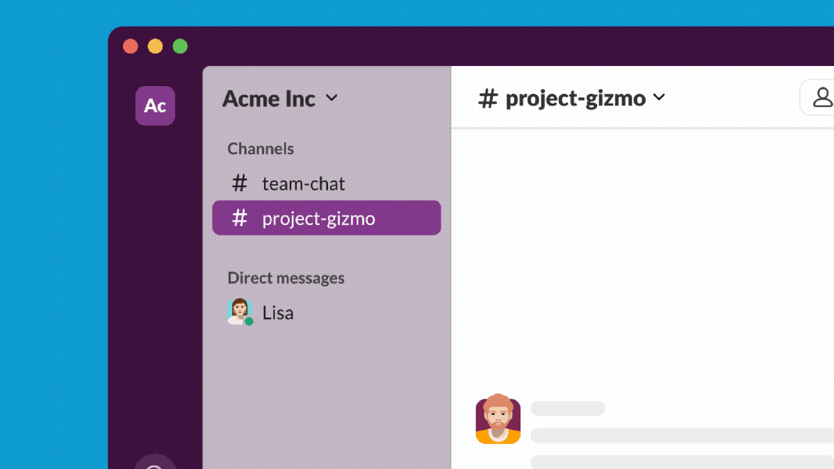
One of the most immediately obvious changes for Slack users is how the channels have shifted to the right. Where they once were on the left, there’s a new taskbar that includes buttons for Home—where all your traditional company channels reside—plus new quick access to see all your DMs. Bubbles will show up on each button to let you know how many people are demanding your attention at once.
Noah Weiss, Slack’s chief product officer, told Gizmodo in a video interview that the new interface is supposed to help workers feel a little less anxiety about missing any big important messages. It also gives more prominence to features added in since the last big UI update in 2022, like huddles.
“If you rewind to the last big design change we made in 2020, that was when people were starting to spend a huge amount of time in Slack all day because they couldn’t come to a physical office,” Weiss said. “Now [Slack] is a full suite of productivity capabilities.”
There are a few new functions that work within this redesign for those with a lot of people messaging them at once. Users can set up reminders to respond to conversations at a later time. The “Later” function shows all the conversations and tasks users marked to follow up on at a later time, and you can see your in-progress, completed, and archived activities.
The “Activity” button shows all recent mentions, reactions, and app notifications, and there’s dedicated tabs for each of those if you just want to see which emojis coworkers are laying on your posts. All activity posts show up in a timeline with the most recent at the top, but you can also toggle the “Unreads” button to only show the content you haven’t clicked on yet. The new full DMs tab also has the same function.
The new search function finally lets users dig through messages, files, and channels with the same query.Screenshot: SlackThe left taskbar also includes a new “create” button to write new messages, huddles, canvasses, or new channels. The search function has, mercifully, been overhauled. It’s no longer tied to specific channels and will instead search throughout your DMs, threads, and more. You can also easily swap between looking at messages, files, people, and channels when searching.
Though there’s still no word on any plans for end-to-end encryption, the new create function does open up the app to even more work tools, which all signs point to being very AI-focused. In March, Slack announced it was adding a ChatGPT-like chatbot into the work app. That function is still in a kind of beta, though Weiss hinted the company was trying to consider even more ways to shove AI functionality into the workplace app.
Weiss didn’t offer many hints about what other AI could be coming to Slack, but he did say the AI was very good at “taking large amounts of text and pressing it down into small amounts of text,” which points to some generative AI that could summarize unruly conversations or generalize talking points.
The new UI will roll out to new teams now, but other existing customers will see the new Slack AI in the coming months going into the fall.
Source: Gizmodo.com
Powered by NewsAPI.org