Todoist's latest feature helps you better organize upcoming tasks - 2 minutes read
 Todoist
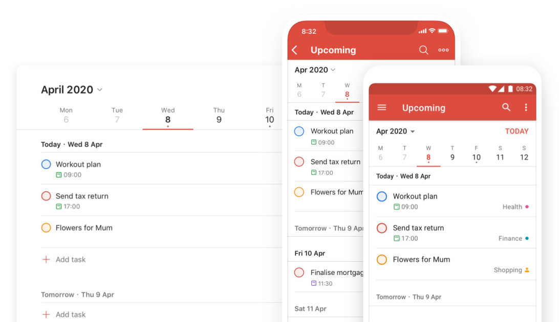
Upcoming View will be easily accessible in the left navigation right under Today and simply labeled “Upcoming.” You can either scroll down to a specific day or jump directly to it by clicking on it in the week’s calendar across the top. To venture into the future, swipe left or use the arrows until you get where you need to be. You can also jump to a specific month with the drop-down menu. And when you have already assigned items to a specific day, a dot will appear under the number in Upcoming View. With a glance, you can tell what days are completely free without have to search for any details.
Thanks to the “dynamic add” button Todoist introduced in October, you can drag and drop the add task button on a specific date in Upcoming View. You can also drag and drop individual tasks to reschedule them as needed without having to navigate elsewhere.
The company has also given the app more room to accommodate your productivity on desktop and the web. A wider layout that works better with larger displays than Todoist has in the past. To make the space even more efficient, you can also hide the left navigation entirely to focus on a particular list. Simply hit “m” to switch between the two or click the menu icon in the top left. Clicking anywhere on a task will now open up the task view, which puts any sub-tasks, comments and the activity log front and center.
Upcoming View is rolling out to Todoist users over the next 24 hours, so you shouldn’t have to wait long to give it try. The app is free to use, but more robust features are available to Premium subscribers for $3 a month. Those tools include reminders, filters, labels, comments, file uploads and the ability to add tasks and comments by forwarding an email.
Source: Engadget
Powered by NewsAPI.org