Google’s new retro-style font brings back serifs for more comfortable reading - 2 minutes read

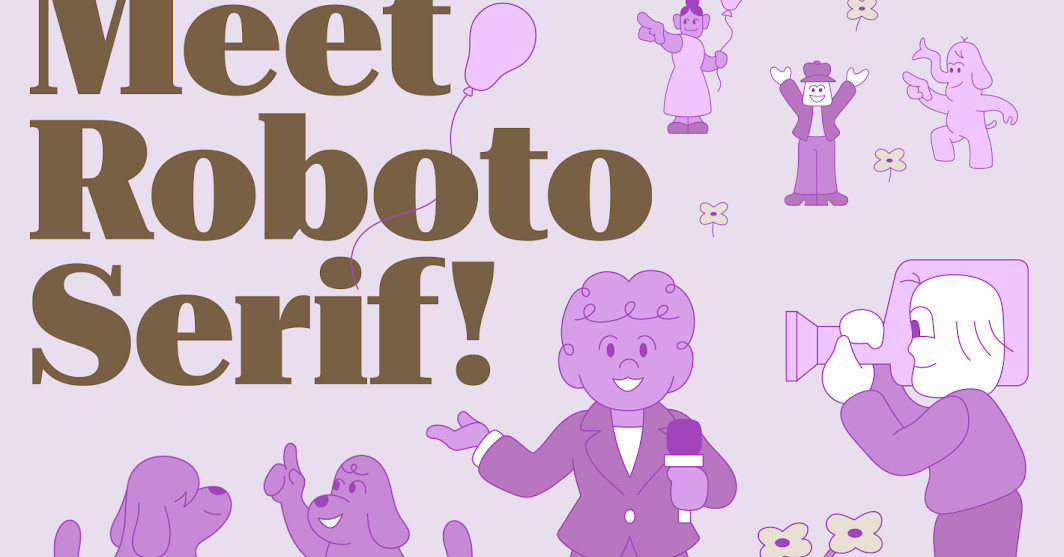
Google has a new version of its Roboto font, and it’s bringing serifs back: the aptly named Roboto Serif, designed in collaboration with Greg Gazdowicz of Commercial Type to create a more readable serif companion to its Roboto Sans typeface.
The new font isn’t just the old Roboto letters with some serifs slapped on, though: rather, each letter was redrawn from scratch to create a font that “thinks about Roboto, but is a new and original design,” according to Google UX manager Rob Giampietro. The new font still uses the same vertical proportions of Roboto Sans, making it possible to mix the serif and sans-serif versions in a single design.
It probably also helps that chunkier, retro-styled serif typefaces are coming back in style in a big way after years of minimalist san-serif designs dominating, as noted by Vox. Serif fonts are also considered to be easier to read, thanks to the more distinct letter shapes, something that Google’s new font expands on by virtue of being a variable font that can automatically change and optimize the letterforms for different size displays.
Google has been using its Roboto font in one form or another for over a decade; it was first introduced alongside Android 4.0 (Ice Cream Sandwich) as the default font for the company’s mobile OS. Roboto has seen plenty of variants over the years, although it’s slowly but steadily been superseded as the company’s primary font by Product Sans (and its Google Sans variants, also known as the “Pixel” font) across its various products.
For now, Roboto Serif is simply being added to Google Fonts as another option for the company’s Roboto family of open-source fonts — but it’s entirely possible that Google may one day use the new, friendly looking font in its own marketing, too.
Source: The Verge
Powered by NewsAPI.org