Game changers: the designers innovating graphics for sports - 3 minutes read

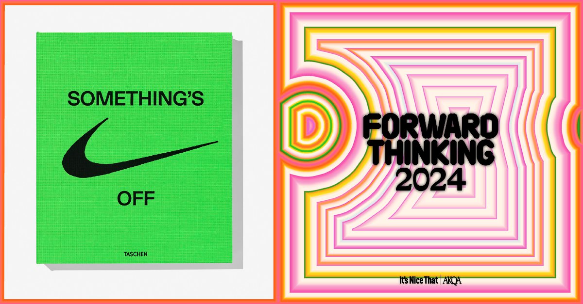
The London creative design agency, Zak Group, used bold minimalism on its latest design projection book for Nike. Nike made itself a leader in brand identity and forward-thinking by creating a lifestyle around bold activity and timelessness. The engaging Ferrari-red that vibrates under the black serif title After all, there is No Finish Line represents Nike’s appeal to emphasis by controlling space. The book’s contents stay true to minimalism and emphasise highlighted greyscale images, which impress sleek and futuristic metal skin. The metal skin and highlights allude to space age exploration in a way that feels nostalgic to past expectations for the future and genuinely futuristic by using frosted metal as a sleek natural texture. Zak Group’s seven-person team is an example of how a tight, well-organised team can to push the envelope forward without extra fluff.
When asked about the design trends that will stick out in 2024, Zak Group’s director, Zak Kyes says: “Smaller design offices that can ‘specialise to generalise’ will continue to have an advantage over larger agencies.” Zak believes smart brands will establish themselves as the new cultural patrons.
In sports graphics, space can form a sense of dominance without being heavyhandedly masculine, which appeals to a larger audience by raising inclusion. Form follows function, and British agency Happy Ending’s BBC Cricket rebrand shows an expert exploration of form by using negative space as a function to guide the audience’s eye and recognise cricket equipment. This collaboration works well for those who know cricket. Emphasising cricket equipment with high contrast and large proportions helps translate the cultural impact of the sport. Happy Ending makes more with less, then goes further by bridging the digital and physical divide by making the physical graphics reminiscent of a digital visual language with dotted, grid-like patterns.
“We leaned into a really, really strong colour palette,” Happy Ending founder and creative director, Ross Popejoy, says. “The use of motion was designed to bring energy as opposed to slowly leaving on video footage, which would normally happen in these kinds of worlds. We utilise 3D objects, which gave us some texture and flavour to say, we want to attract you here. I think that utilising design allows us to also say, hey, we are for you. [Design] becomes super vital.”
Through the dotted pattern of the 3D images, Happy Ending’s design team has decreased the weight of the imagery so that it’s that much more approachable. There’s still impact and order without imposing dominance or superiority. Being approachable opens space for new audiences to accept how they’re different and where they fit inside the framework of a strong identity.
Source: Itsnicethat.com
Powered by NewsAPI.org